Meaningful minutes spent for true rowing experience
Exploring my journey in crafting the WATERROWER Connect project through the lens of product design – from diving into a full app redesign to notable releases to how it impacted the WATERROWER Connect app usage, and more
TL;DR
Led the WATERROWER Connect app UX team, guiding design direction.
Cultivated effective cross-departmental collaboration processes.
Orchestrated a complete redesign of the app.
Utilized user feedback and collaborated with rowing experts to enhance the user experience.
Spearheaded product design in new feature development and ideation.
Championed user-centric approaches throughout the redesign process.
Implemented a minimum approach to feature development, breaking down releases into phased iterations.
Nurtured a close relationship between the Design and Engineering teams.
Ensured rigorous quality control to deliver the highest possible results from a product design standpoint.
Stepping into WATERROWER
The WATERROWER Connect app isn't just a monitor app packed with data for your workout; it's a holistic lifestyle platform designed to enhance your rowing experience and promote overall well-being. Imagine having a personal coach, a data analyst, and a community of fellow enthusiasts all in one sleek interface. That's the essence of the app.
When I first joined MoveLab Studio, the company behind WATERROWER Connect, I really didn’t have time to get my feet wet. After the initial days of setting up a new company, we dove immediately into work. This type of “get shit done” approach was no news to me – having had my fair share of startup experience, I knew that the pace will be fast and there will be little room to take a breather. Boy, was I not prepared for the hyperspeed we’d be going at until the very end. Silicon Valley execs would be proud. My role was simple – take a lead on product design. From the look and feel, UX, usability, desirability, quality control, collaboration, handoff, stakeholder alignment, dreaming up new features, branding, guiding and growing the team, and much, much more – there simply was no end to the list. But at no point was that an issue – we gladly stepped outside our job descriptions and responsibilities, just to help each other out within the entire crew. Next steps were relatively simple, and by this point in my career, fairly expected – a complete facelift.
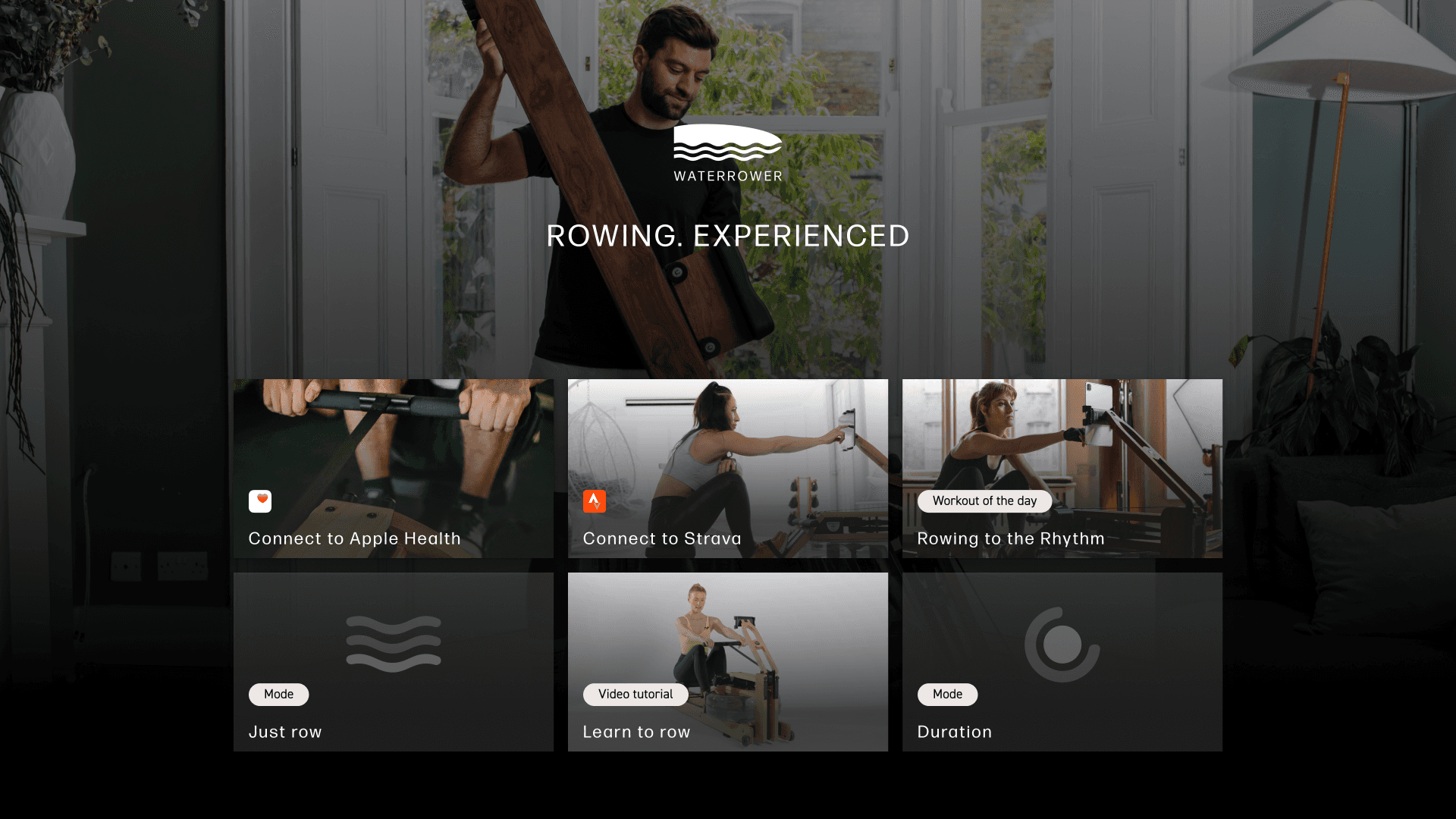
In with the new
The design files were a mess and the general UI direction was questionable at best – but nothing I haven’t seen before. At that time a company cooked up a quick UI which would be passable enough for a first release. Then, after a little while, when the service bares enough fruit, in-house designers were hired to fix all the holes left from the first iteration. That’s where I came in. The designs were okay, but far from great. We simply started from square one as the files were in no shape to be built upon. The vision for how it would look like was clear to me immediately – luxurios dark gradients, edgy components, shapes and images that speak to the future of rowing, rather than the past.
iOS trial to paid conversion
▲ 26% - 31%
30-60 day user engagement
▲ 47.4%
The initial facelift immediately resonated with users and our trial-to-paid conversion metric rose by 5%-6% and stayed at this mark. It's an essential needle to move from a business perspective as well as validation that our move to redesign was the correct and profitable path to take. User engagement also role substantially - it beat the previous engaged time in app by 13% and remained higher than the norm by up to 7% on the 7 month mark (16.2% vs the older design 13.8%)
System reboot
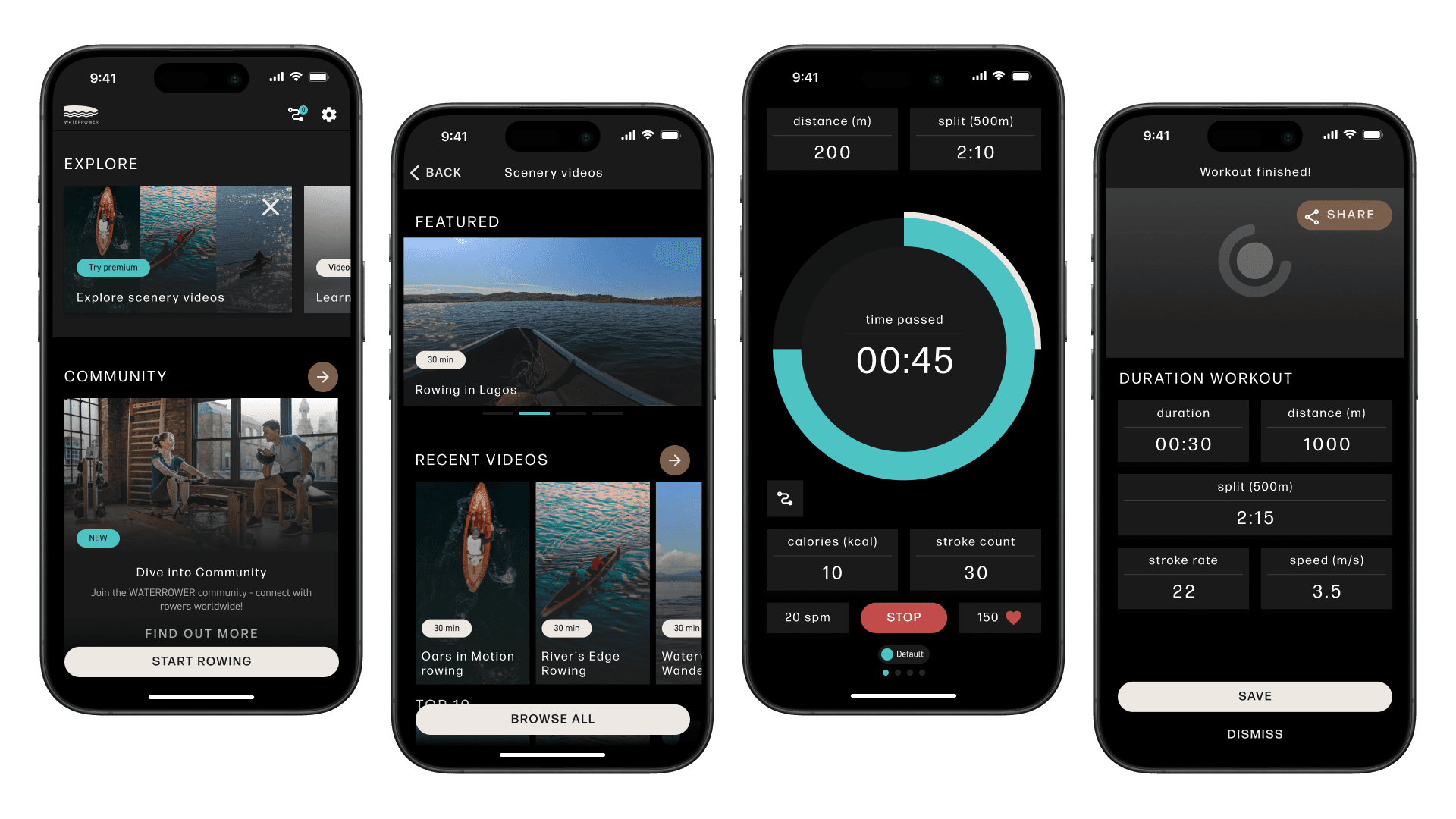
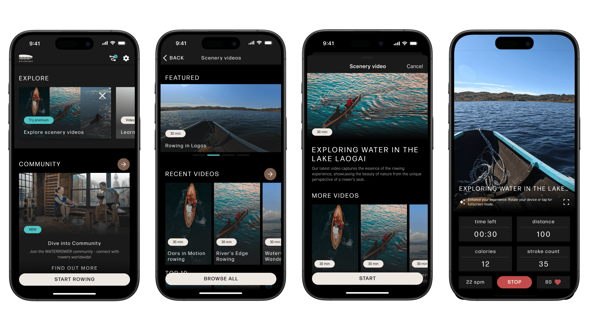
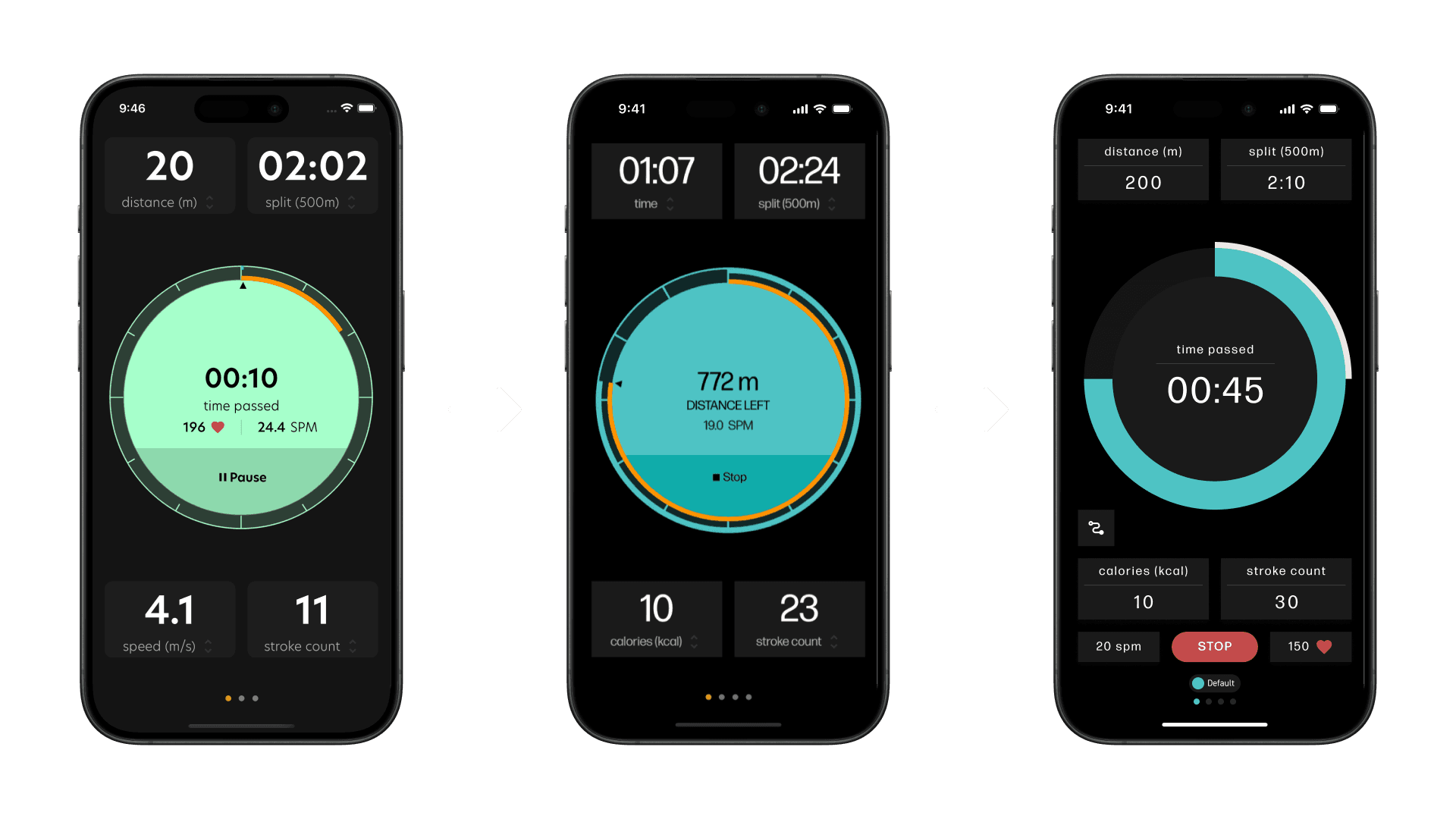
Kickstarting the entire design side was never an easy task, especially on a product that’s so data-heavy – and was about to get even more content at a time that I joined the team. To accommodate this, we extended design system that would increase readability for big screens (as is the standard practice in usability). The sheer amount of adaptive components (for both mobile and tablet devices) created in such a short timeframe still amazes me! Thankfully, we opted for a more visual approach combined with workout data, enabling us to create those components really quickly.
Notable releases
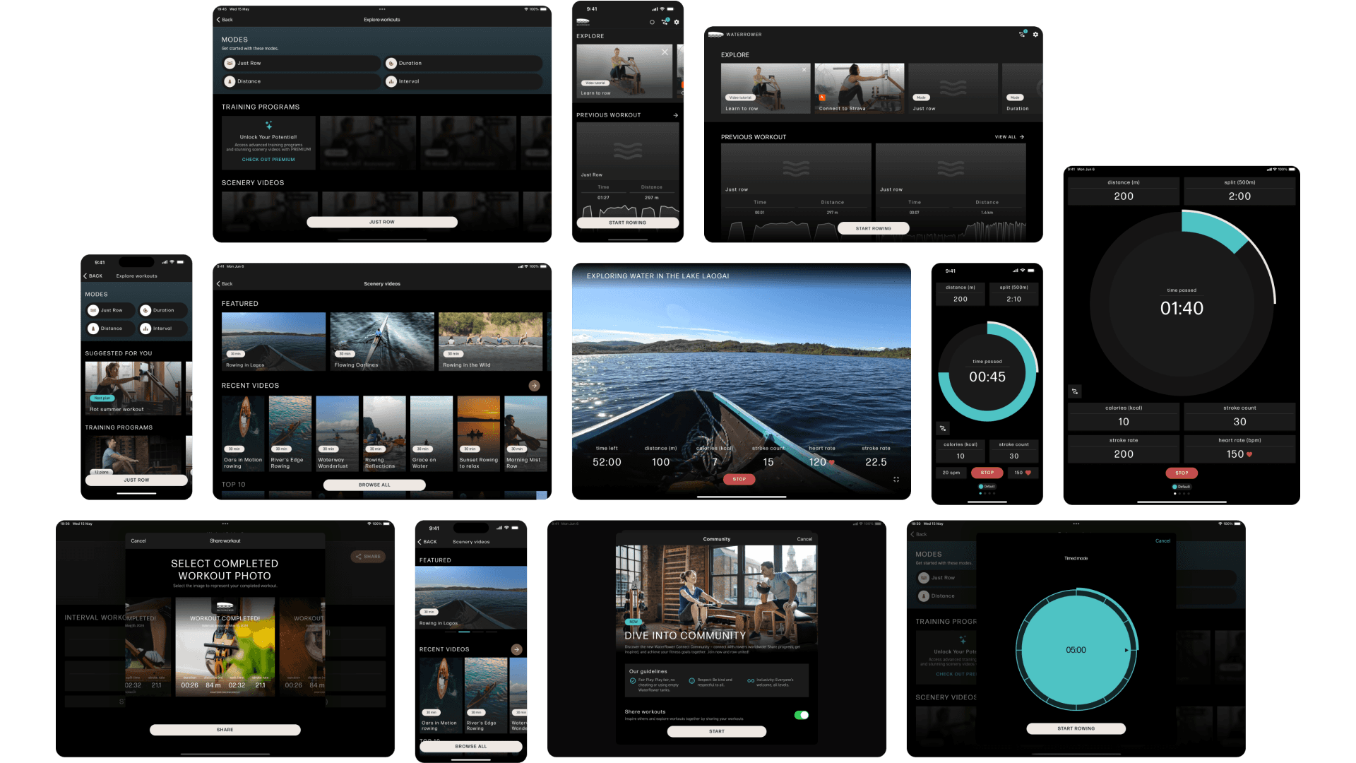
The facelift stage basically required us to create a sense of UI direction and fix minor UX issues along the way – which created a good opportunity to polish some of the features on the surface level. Given the limited resources, we couldn’t polish all the features the way we wanted (more on that later), but some initiatives were larger than others, where we pulled out all the stops and completely re-invented them. One such release was the 'Scenery videos' feature – a custom-curated video library that would allow our users to follow a video during a rowing session. Based on gathering data from our current users and comparable competition, we've realized that marketing ourselves as the ultimate digital monitor for rowing was not enough. Our users were seeking more well-being features rather than solely focusing on tracking data.
Reaching the crescendo
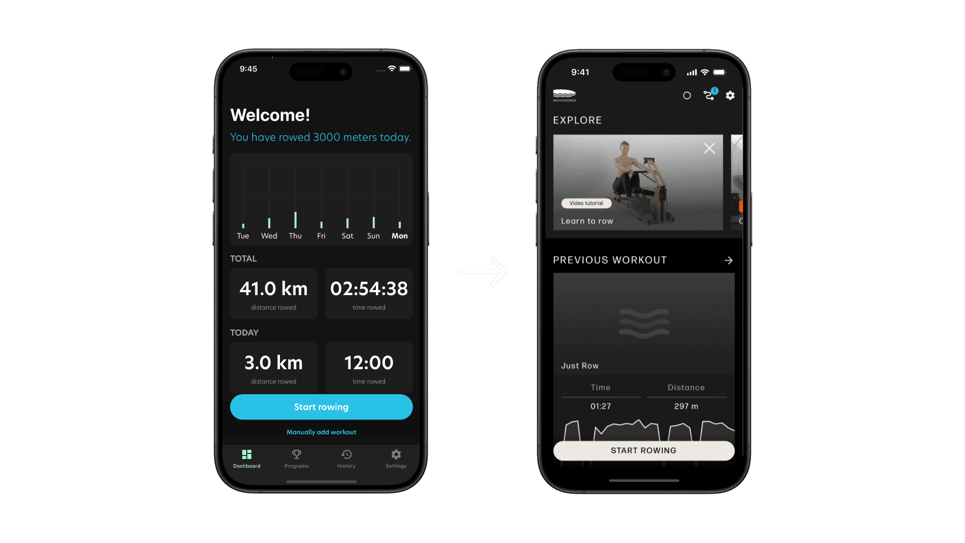
We completed the full facelift in record time: 8-9 months. That’s an incredible feat considering we almost started from scratch, and could barely lean into data and user feedback since there simply was very little to go by. Now, once the facelift is was finished – and even throughout the process – we finally had accumulated data on Looker as well as user feedback pouring in. With that we begin the next phase – polishing. Starting out with session screens, the difference is definitely noticeable and more reminiscent of what a content rich app should look like. While we did save time and development efforts during the facelift phase, this is where we would catch up and fix ALL the usability issues that we couldn’t get to earlier. Another initiative that took place in parallel was to round up all the variables and building blocks, and have conscious re-usability play a hard hand in this next phase. Just to ease developers from creating new elements per feature. It was unclear at first due to the structure that the app had at first, but again – this is where we make it right. This is where the entire redesign is finished. This is also the time in development where we pump the breaks a little bit and really think about the user from a usability/delight perspective. How to make the most pleasurable as well as effective experience possible in order to retain them, offer better engagement, and activation. My motto remains as firm as ever – the product must feel good to use, as well as look good while using it. There’s simply no other way around it. To me this is the highest quality app that you can have – one that has a strong desirability factor, as well as great UX to boot. In my mind, these two principles cannot exist separately.
Smells like team spirit
The WATERROWER Connect app and its rowing machine has a bright future ahead if the current momentum is maintained. Engagement is way above average for such a niche product – and users are vocal with their feedback, which gives us ease and tremendous insights on how to shape our product to be the best and truly one of a kind. The team aspect @MoveLab is unmatched. Each and every one of our crew is driven and willing to go the extra mile to simply make things work. It’s very fun to work in such an environment where you know you won’t be left in the dark, or otherwise completely alone, with a problem that needs solving. A team spirit that’s truly to be envious of – and one I wish everyone get to experience at least a few time in their career.