Building seamless home gym experience
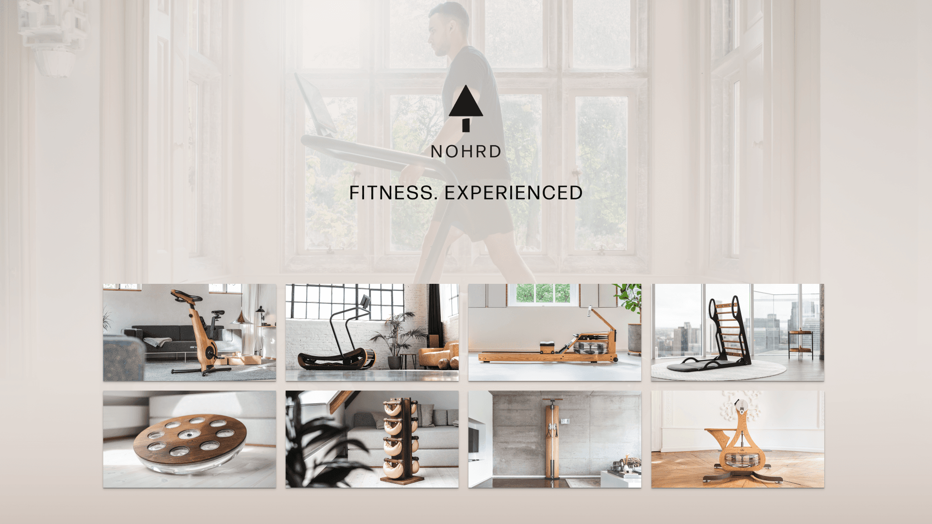
An overview of several topics I covered at NOHRD, a Germany-based company renowned for its high-quality fitness equipment and innovative digital solutions.
TL;DR
Lead the design development for the NOHRD Connect app on both Android and iOS platforms.
Revamped critical areas of the app, enhancing visual appeal and functionality.
Continuously monitored user feedback to refine and improve the overall user experience.
Collaborated on brainstorming sessions to conceptualize and develop future features for the app and suite.
Actively participated in user interviews to gather insights and ensure user-centric design approaches.
Advocated for user-centric design principles throughout the development process.
Contributed to the product's rebranding efforts, focusing on a cohesive design perspective.
Designed unique visuals for the entire suite, including illustrations and product app icons.
You may wonder...
Due to the close business relationship between WATERROWER and NOHRD, the WATERROWER Connect and NOHRD Connect apps share the same design system I created, leading to a similar look and feel. However, a key difference lies in the NOHRD Connect app's focus on a seamless gym experience, integrating multiple gym equipment devices for a cohesive, single workout session.
The blueprint
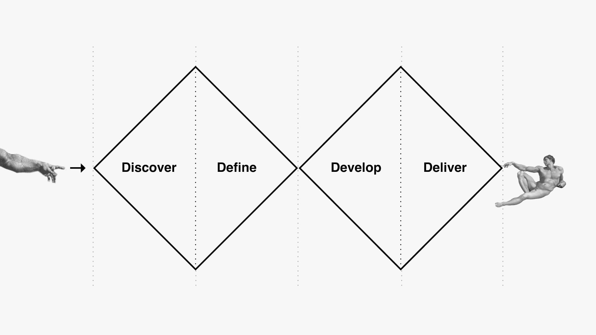
I’m sure this image has been seen a thousand times by anyone working on product. It’s the ideal blueprint of how features/updates/changes are meant to be applied. While not always following it exactly - this was the approach we always had in mind when tackling various features & improvements for NOHRD Connect.
Explore view
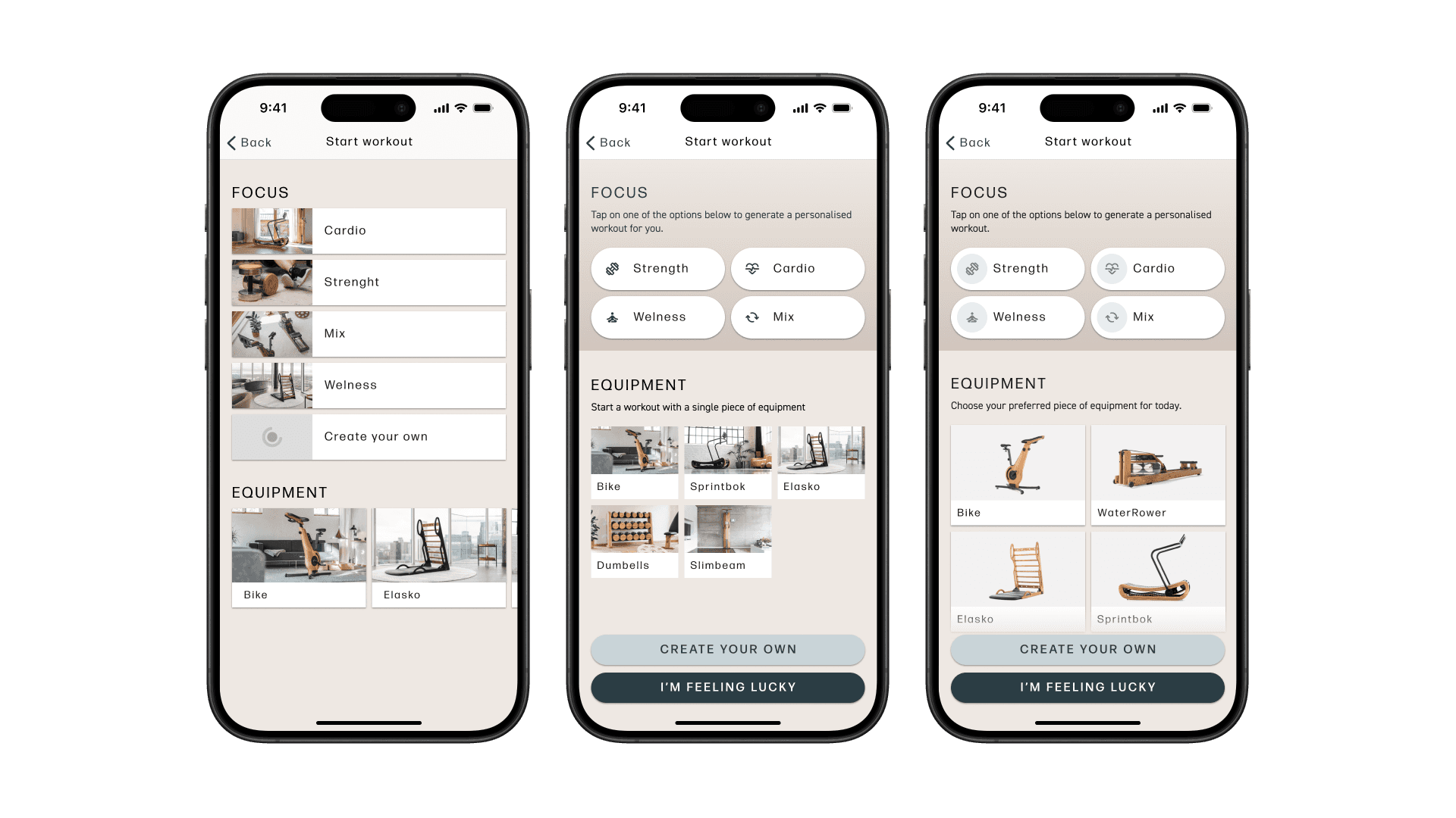
In my mind, two areas of extreme importance within an app like NOHRD Connect are the explore view and the workout view. Both are crucial for how quickly users can access their content and how that content is presented based on the gym the user owns. The initial foundation for the explore view was laid by the previous designer, providing a solid base that I could enhance with edge cases and detailed requirements specific to the product. Working with the team, we aligned with stakeholders and long-time users to deliver a significant update to the explore view. We closely monitored user responses and relied on feedback to refine our initial design. In my latest update, which I call "content is king," the focus is on highlighting the main content as much as possible. We also incorporated a contrasting outline for better readability, especially for users with visual impairments (see below).
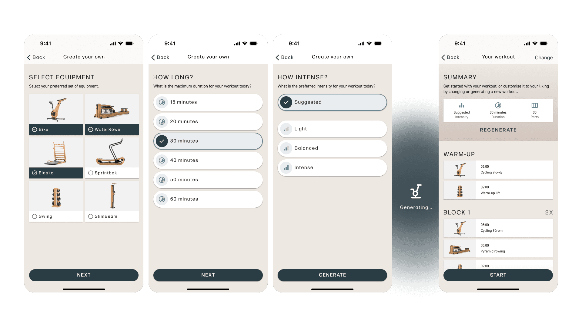
With NOHRD Connect, we quickly identified several key updates to enhance the user experience. One priority was always ensuring accessibility, particularly with color schemes. This led to updating the taxonomy on a global level, sparking broader discussions within the product design team and allowing us to consider the entire product suite more thoughtfully. The Focus section initially felt cluttered, and the Equipment section didn't provide a comprehensive overview of the user's owned equipment. Addressing these issues was crucial for improving the overall user experience. We streamlined the Focus section, making it more intuitive and less overwhelming. In the Equipment section, we added a clear summary of the user's owned equipment, ensuring easy access to relevant information. We also introduced features that significantly enhance workout customization. Users can now create their own workouts, tailoring them to their specific needs and preferences. Additionally, we implemented an AI-driven workout generator, allowing users to automatically generate workouts based on their goals and available equipment. These improvements collectively ensure that NOHRD Connect offers a more seamless, user-friendly experience, aligning with our commitment to excellence in both design and functionality.
Workout upgrade
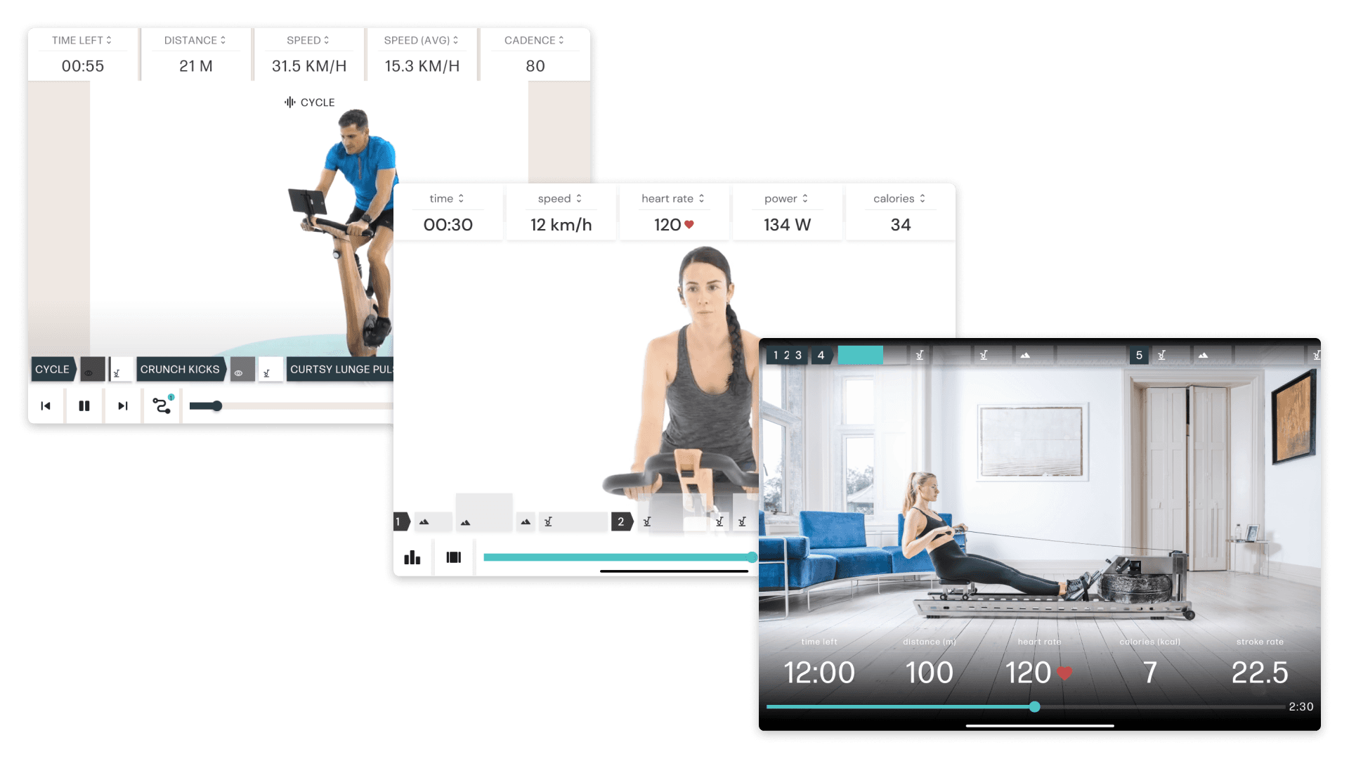
The session screen in the NOHRD Connect app underwent significant improvements aimed at enhancing the user experience and providing clearer, more intuitive controls for managing workouts. It was crucial that the layout is structured, readable, and immediately understandable. The incorporation of proper media support and a workout timeline with user controls for skipping, pausing, or stopping workouts played a key role in achieving these goals. Initially, the session screen lacked clarity and structure, making it challenging for users to navigate and interact with their workouts effectively. Through a thorough analysis of user needs and stakeholder preferences, a series of incremental updates were implemented to address these issues. The first minor update focused on improving the structure and readability of elements on the screen. This included adjustments to sizing, spacing, and organization to ensure that important information was presented in a clear and accessible manner. Feedback from users following this update was carefully considered to inform subsequent iterations. Subsequent updates introduced total session redesign, dynamic font usage, adjusted font sizes, and improved separation and padding to enhance readability further. These changes aimed to address user concerns regarding content exposure and readability during workout sessions. While these updates may seem minor, they collectively contributed to a more aesthetically pleasing and user-friendly experience. I'm proud of the progress made in refining the session screen. Moving forward, I hope that the next iteration of the app will continue to prioritize clarity and user-centric design principles, ensuring that users can easily engage with and navigate their workout sessions with ease.
Wrapping up
Over the past 3+ years working on NOHRD Connect, time has flown by as I've had the fortune to work on some of the app's most important features. With thousands of users relying on this product, it was a significant responsibility to lead its development. I approached every challenge with confidence and always put the user first. This brief overview barely scratches the surface of the extensive work I've done for NOHRD. From exploring countless new features yet to be released to working on other platforms and participating in global initiatives affecting all NOHRD products, my contributions went far beyond the initial scope of a UX designer. I take immense pride in every aspect of my work and wouldn't have it any other way. Throughout my time here, user-centricity remained my guiding principle. Even when business needs arose, I always prioritized the user and steered conversations to benefit them first. My growth is largely thanks to the amazing team at MoveLab Studio, where we keep making great progress (you know who you are, haha). There's nothing more satisfying in a team setting than having peers who genuinely want to see each other succeed. Sharing knowledge and pushing each other forward is what every product team should strive for.
